Youth Page Redesign
Research & Redesign Case Study
Role
UX Designer/ Assistant PMCompany
Austin Public LibraryDuration
14 weeksProject Overview
Deliverables
Research documents, insights, wireframes, interactive prototypes, and a final case study presentationPartnered with a four-person team to redesign the Youth Page. My role focused on research, design system, prototyping, while collectively we addressed accessibility, event discovery, and building trust with caregivers.Background
Making online resources friendlier for families
Simple enough on paper, until we saw the constraints. We had to keep the city’s existing branding, work with third-party event widgets we couldn’t touch, and still find a way to make the experience feel easy, welcoming, and accessible.Make the Youth Page more useful for parents and caregivers of kids ages 0–12.
When the Austin Public Library asked us to rethink the Youth Page, the goal was clear: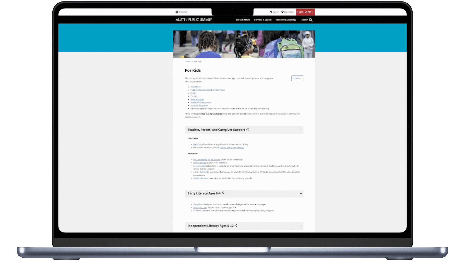

That challenge became our design brief: How do we design something better when parts of it can’t be changed at all?
Listening Before Designing
Before touching Figma, we needed to understand the world our users lived in.

We started with a competitive analysis, exploring how major library systems like Seattle Public Library and London Public Library structured their youth content. We spotted patterns, gathered best practices, and saw clear opportunities for APL to improve.
Usability Testing
Identified where users got stuck, what they searched most, and recurring frustrations.
Participants
Tasks
Methods
5 parents/ caregivers1 librarian
Puppet ShowsRecommendedGroup Cards
Moderated (Original Site)
Two stories stuck with me

A homeschooling mom, just wanted to filter events by age, but the old site made her dig through unrelated listings, leaving her unsure if an event was for toddlers or older kids.Abigail
Alex
A caregiver, planned the week around library events… until showing up for Storytime only to find it canceled. No online update, no heads-up.
These moments reminded us this wasn’t about “website traffic.” It was about real people planning their days, their weeks, and precious time with their kids.
Research Interviews
Participants
Methods
5 parents/ caregivers EN11 parents/ caregivers ES6 librarians
ModeratedGuerrilla


From Stalemate to Breakthrough
Midway through, our team hit a wall. We couldn’t agree on a single wireframe direction.
That’s when I proposed starting fresh, this time using Miller’s Law to organize content into seven core sections.
This structure felt intuitive, respected cognitive load, and aligned everyone. That layout became the backbone of our final design.
Designing for Engagement
User feedback became our north star. One parent summed it up perfectly:“It feels like a policy document, not something for families.”


Original Design
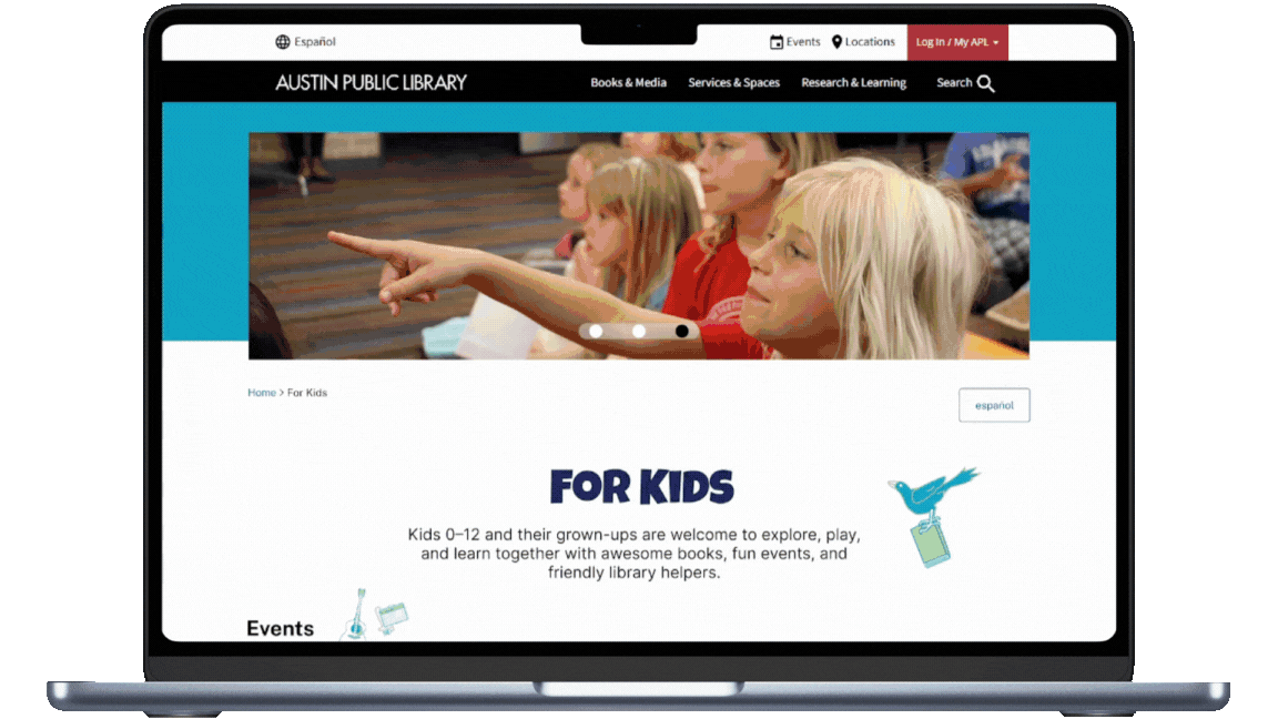
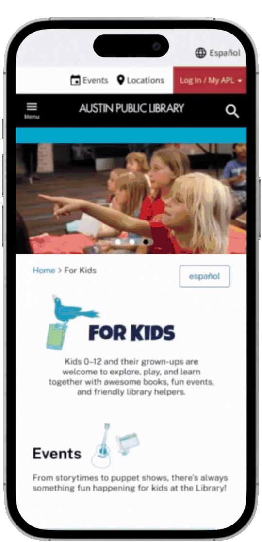
Redesign
We took that to heart. The new design is:Visually inviting — playful icons, color pops, and imagery that makes it feel like a kids’ space.Easier to scan — clear headers, bite-sized sections, and quick navigation without accordion fatigue.Tone-shifted — friendly, personal copy that reads like it’s from your favorite librarian, not a city notice.
Real Impact, Real Fast
One of my favorite parts? Seeing our recommendations implemented before the project even ended:Events now show canceled notices clearly, reducing wasted trips.
Age recommendations appear directly in event listings.
Clicking “Events” from the Kids’ Page now shows age-appropriate results by default.
These changes proved our work wasn’t just theoretical, it was ready to meet real needs immediately.Takeaways
This project wasn’t just an assignment. It was a partnership with a public institution that serves thousands of families.I learned how to:Balance dual audiences (kids + caregivers) in tone and layout.
Design within strict real-world constraints without losing creativity.
Use research-driven storytelling to guide decisions and unite a team.
And most importantly, that thoughtful, user-centered design can have an impact before the ink is even dry.