Amoeba Music
Information Architecture Case Study
Jenifer Dominguez 5 min read May 9, 2024Revitalizing Amoeba.com with Local Passion in Mind
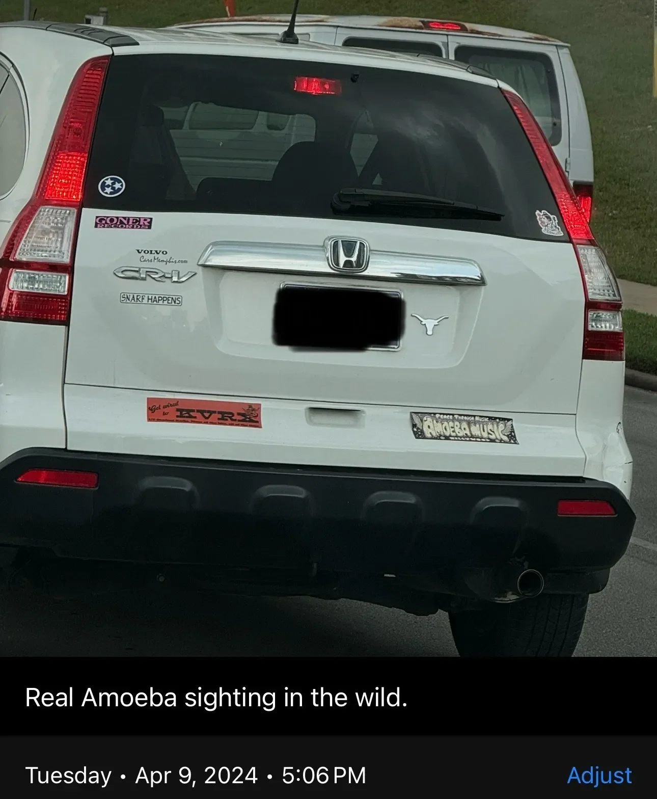
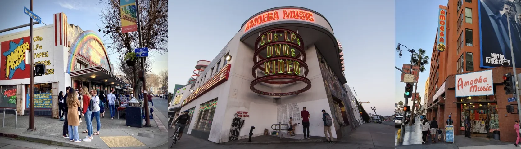
Experience the Disney World of Music at Amoeba Music which occupies an entire city block on Sunset Blvd in Hollywood. Founded in 1990 Berkeley, this iconic franchise expanded to a third location in San Francisco.

In my research and redesign of their website, I’ve remained deeply cognizant of the cherished connection Amoeba Music shares with its local fans, honoring their original passion and ensuring it’s reflected in every aspect of the revitalized digital experience.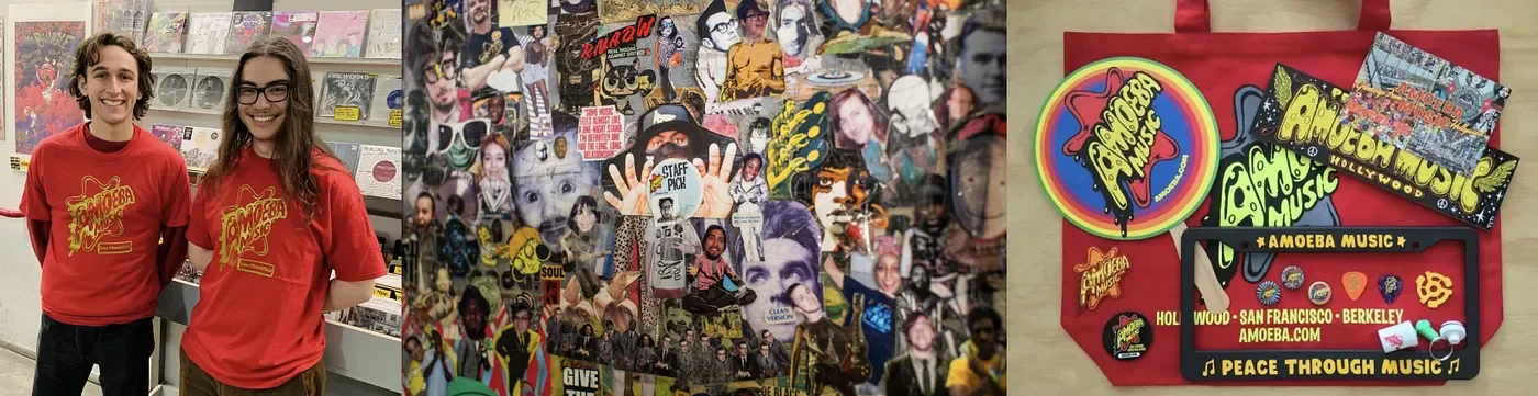
Content Audit
Overwhelmed by the lack of organization and inability to promptly find what I was looking for, I empathized with potential users who might face frustration and disengagement and started sifting through the data pulled.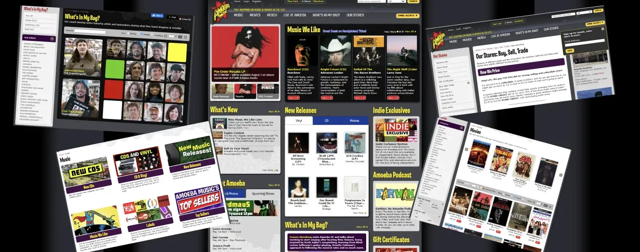
While the quantity of the data was unapproachable at first, I found when completing the audit that it was necessary first step in understanding and consolidating the data to enhance the user experience.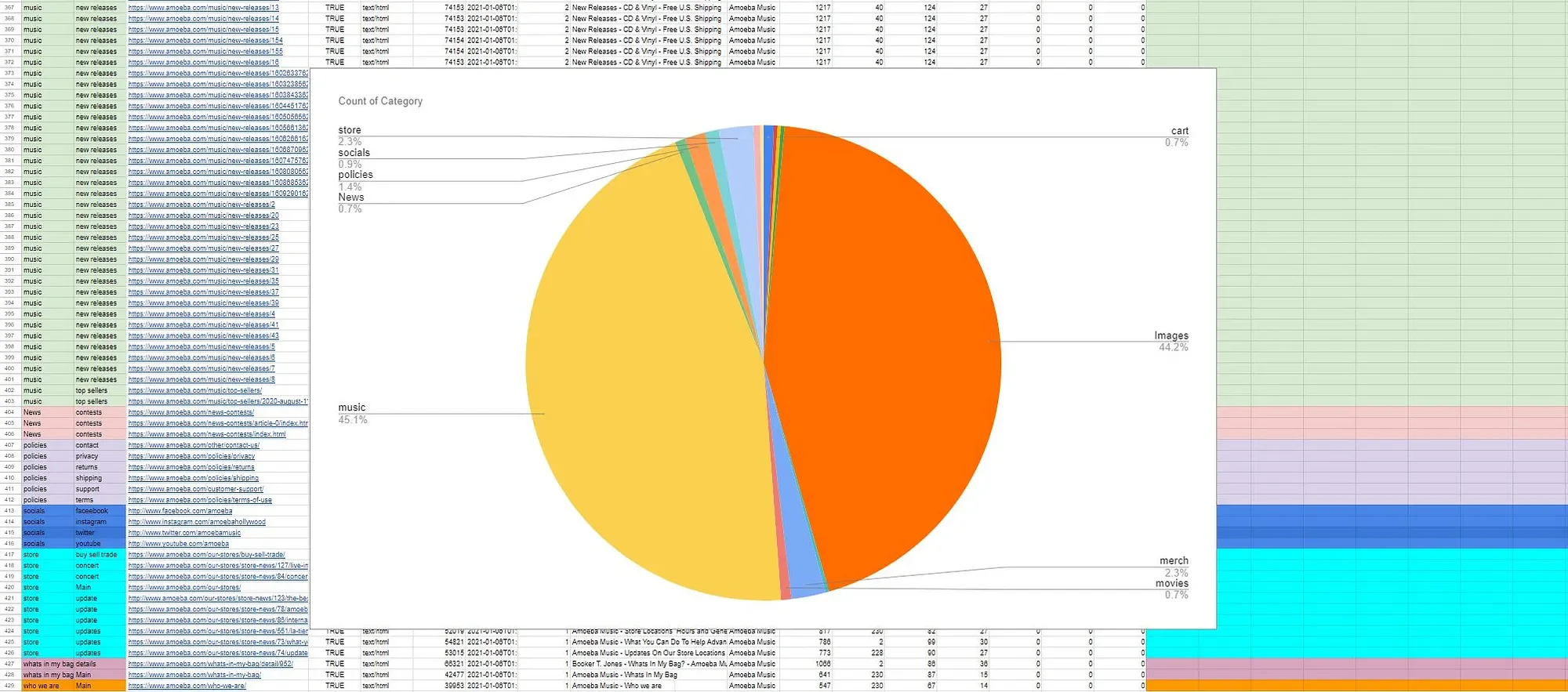
Initial Proposed Sitemap
My sitemap below illustrates a more simplified organization of Amoeba’s content and the relationships between different pages following the audit and feedback.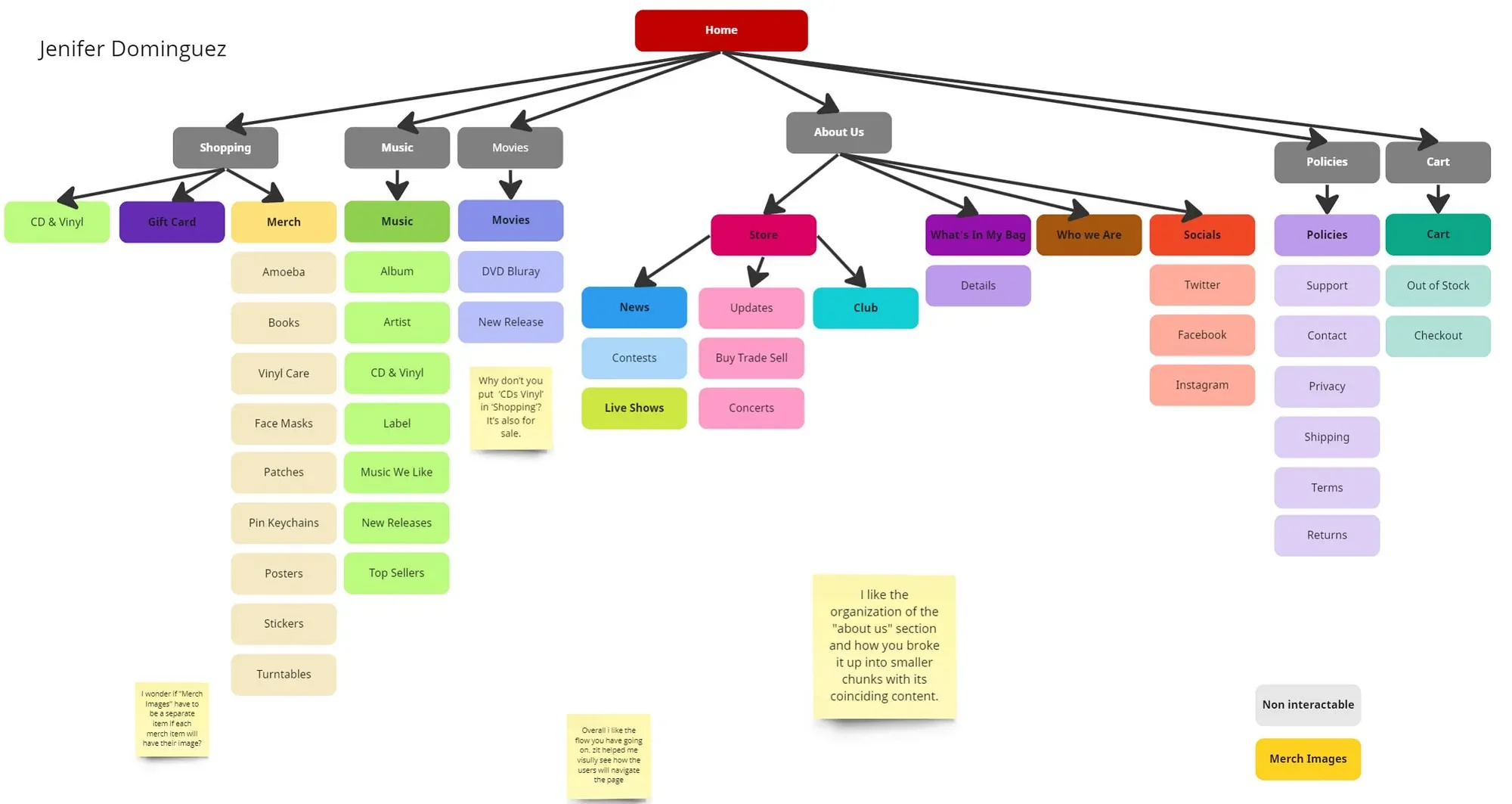
The goal in mind was to help visitors navigate more effectively regardless of familiarity with the site
Card Sort Findings
First obstacle came in deciding whom to test the initial card sort on. I debated between close friends or strangers for unbiased feedback. Then, I realized my musician friends could provide unique insights.
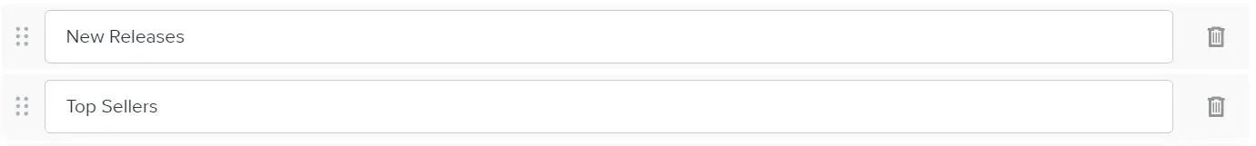
2. Some of the label wording was vague enough that it caused confusion. Users thought “Top Sellers” could be placed in either Movies, Music, or Shopping. As well as “New Releases” in either Movies or MusicUpdated the wording in the labels to be more precise while still having simple language for all user understanding
2. Participants had a desire to have as little groups as possible.I saw this as an opportunity to create consolidated categories for faster yet intuitive searching.
Tree Test Findings
Through testing of 10 users I was able to assess whether users can successfully locate and navigate to desired content or within my initial proposal for website’s structure.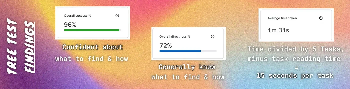
Satisfied with the high percentages I focused my attention on where the system could be enhanced.
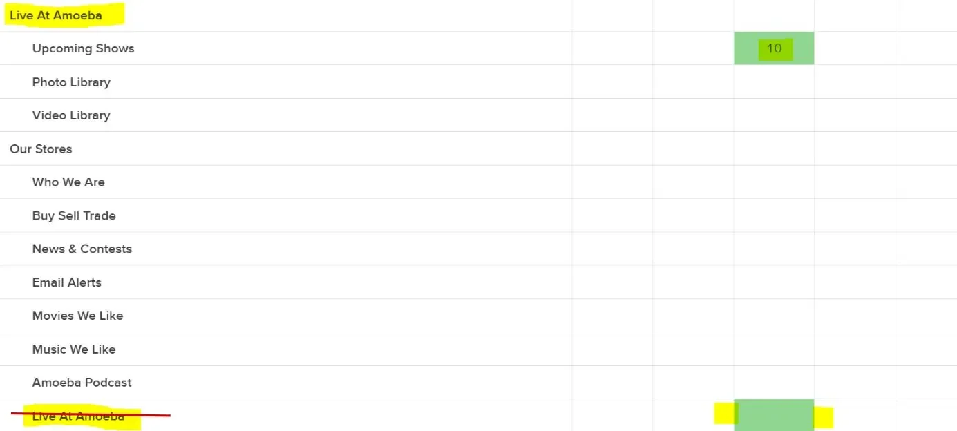
I created a direct path to Live At Amoeba originally. Believing that user’s may go to the Our Store section to find live shows, I created another path that would lead to this result.No participant used this path so I removed it entirely.
Final Proposed Sitemap
After thorough testing, data analysis, and iterative refinement stemming from the Content Audit & Tree Testing, I refined my sitemap.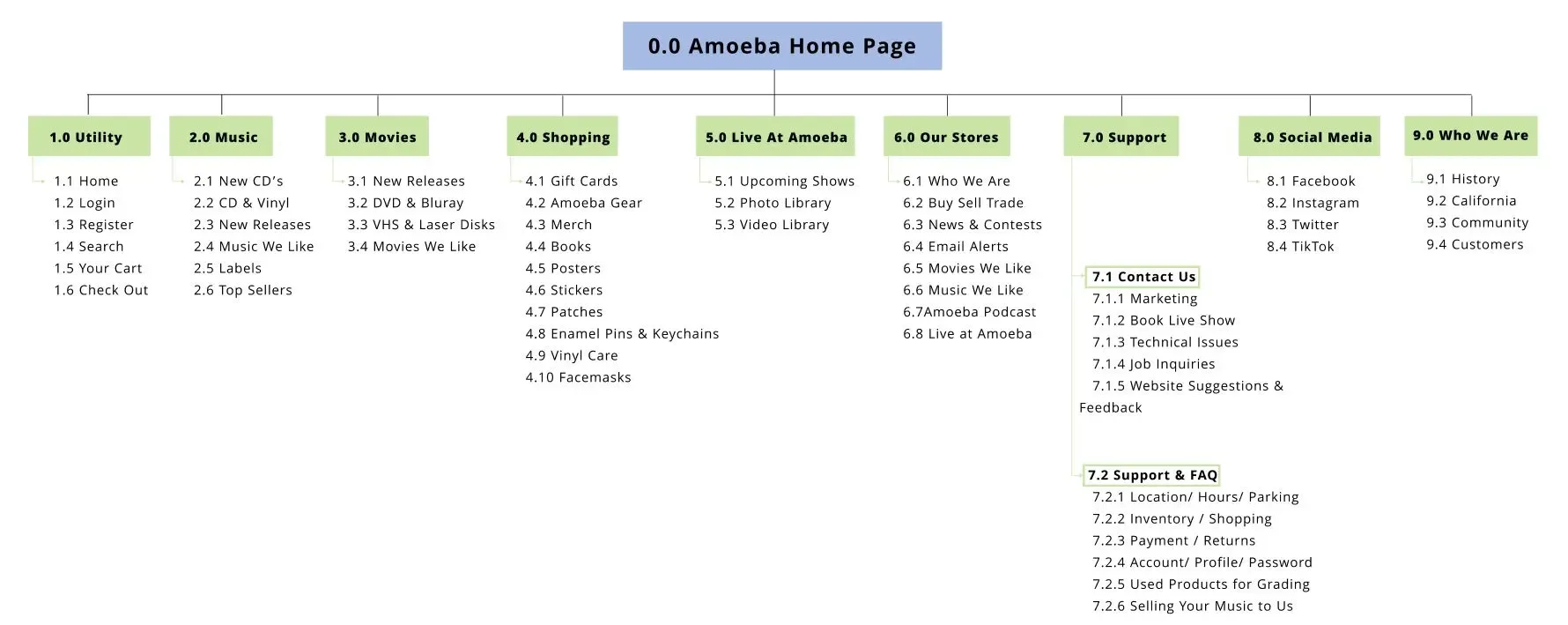
My primary focus was to ensure that users can swiftly locate desired content without cognitive strain, fostering intuitive navigation and instilling user confidence.
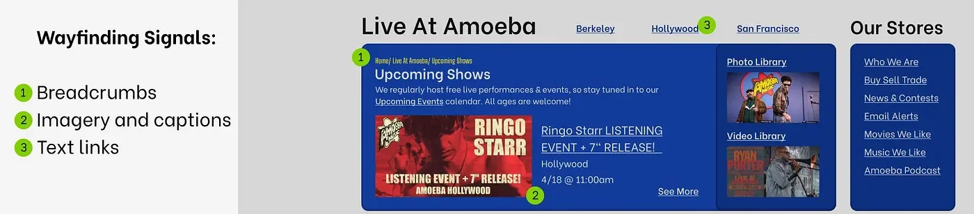
Proposed Navigation & Wayfinding
Now all this work has lead us to this updated version of Amoeba.com. Feedback was given about my initial wireframe proposal that helped me not just create a better navigating experience for users, but also keeping the Business Goals in mind to drive sales online and traffic to it’s stores.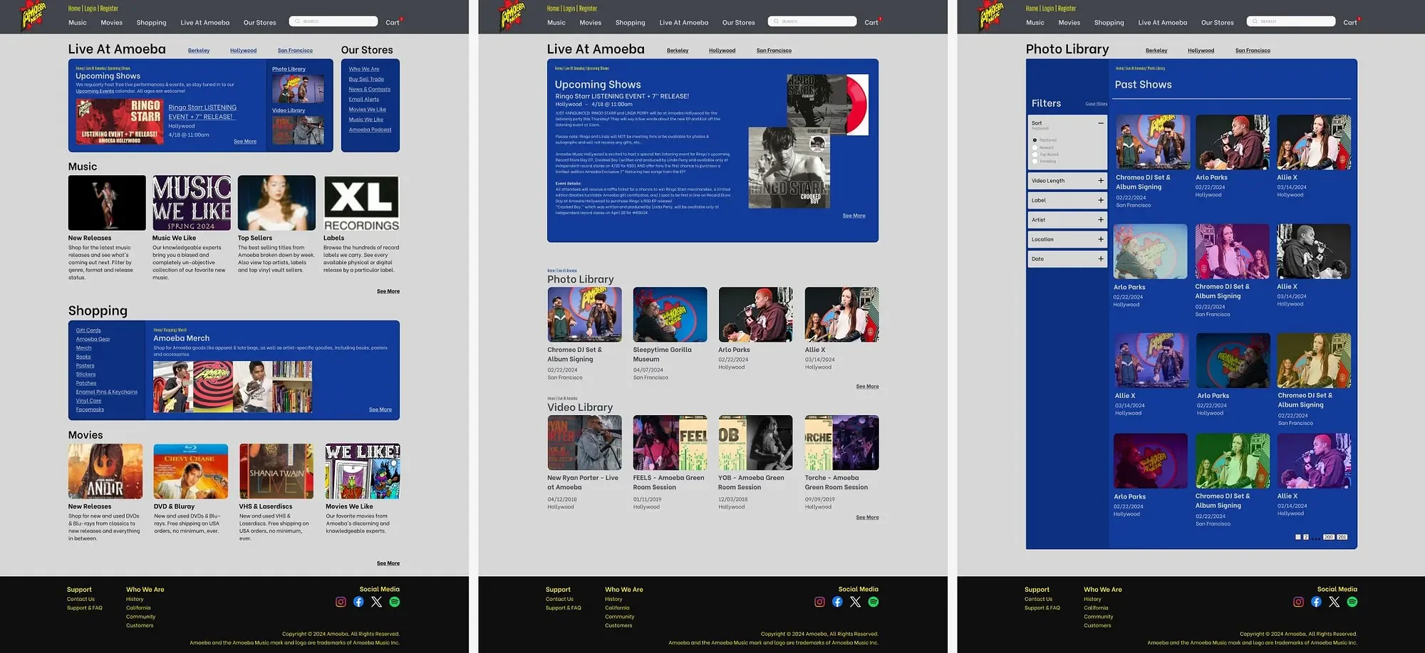
These Wayfinding Signals incorporated are crucial for guiding users through physical or digital spaces effectively and intuitively.
Initially, I integrated 1–3 of the Navigation Structures before receiving feedback. In response to user needs and insights, I introduced a Filter option for sections of the website overwhelmed with sub-links. 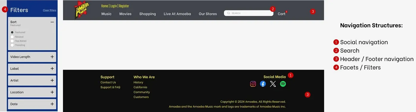
This addition aims to assist users in refining their options and locating desired content more efficiently.
Final Thoughts
In conclusion, this case study has demonstrated the effectiveness of applying several different elements of Information Architecture in order to address the challenge of creating a effective and intuitive design to help all users feel confident when shopping online and in-store at Amoeba Music while helping the company reach their business goals.By testing and redesigning the website, I was able to consolidate and organize key categories, ultimately leading to faster and effective user navigation.Through this process, I learned valuable lessons about significance of prioritizing user needs and preferences in design, which by actively involving users in testing and feedback loops, I gained valuable insights that drove informed decisions and refinements.